|
Athro, Limited
|
This document is an introduction to how to read topographic maps and some of the sorts of features that you can find on them using examples from central Montgomery County, PA, USA in the vicinity of the Montgomery County Community College (MC3) main campus in Blue Bell. There are quite a few good introductions to topographic maps on the web (the USGS has a very good one), but sometimes it helps to start with a map of somewhere familiar.
Below is an image of the Lansdale Quadrangle. This is a 7 ½ minute, 1:24,000 scale topographic map. It is the typical modern USGS topographic map. Most or all of the contiguous 48 states are covered by maps at this level of resolution. This map was compiled both by sending surveyors out to map out the location and elevation of points, and by drawing in additional detail from areal photographs. The main Blue Bell campus of MC3 is on this map, and we are going to explore some of its environs. The image below is too low a resolution to see any details, we will be looking at closeups from this map.
|
|
This map covers part of central Montgomery County. Landale and North Wales are up in the northeast corner, East Norriton and the edges of Norristown are down on the South edge. The big red line running almost North-South through the middle of the map is the Northeast extension of the PA Turnpike. The main MC3 campus is a little bit southeast of the center of the map.
The bottom of the map has lots of useful information. This includes a scale:

The scale gives us a good feel for how far apart two points on the map are. Unfortunately, it doesn't work well here, as the various images I have taken from the map are at different scales. The scale also gives us some other information – it tells us that the contour lines are 10 feet apart – and it says what vertical datum (the thing that tells us what an elevation of 0 feet is) was used to establish elevations on the map.
|
Also on the bottom of the map there is some history information – how old is the information on the map. On this map, this has two parts – one is the original information in black – the map has its basis in aerial photographs made in 1950, with surveyors going out in the field checking elevations in 1951. This was then revised in 1965-66. There is also a bit in purple:
Lots has changed around here in the last 5 years or so, let alone since 1981, so we can expect this map to be quite out of date. |
|
|
There is also a little graphic on the bottom of the map indicating about where in the state the quadrangle is located. This isn't particularly exact, just a rough guide to help orient you. The edges and corners of the map also indicate the names of the adjoining quadrangles, to help you move from one map to the next in a big stack of maps... |
|
|
At the corners and along the sides of topo quads you will find coordinates – locations of the edges of the maps on the surface of the earth. The Northwest corner of the Lansdale quad is at 40 degrees, 15 minutes, zero seconds North latitude, and 75 degrees, 22 minutes, 30 seconds West longitude. There are also more funny numbers on the sides of the Lansdale quad, such as the 4455000mN in the image to the right. In this case, this is a different grid system, the Universal Transverse Mercator (UTM) grid. This is similar to the military grid reference system. These grids (which are becoming more widely used than they used to be with the availability of GPS recievers that can display your location in UTM or other coordinate systems) allow you to specify a 1 meter by 1 meter square on the surface of the earth (or a 10 meter by 10 meter square, or 100 meter by 100 meter square, or 1 km by 1 km square), and are much more intuitive for some local navigation uses than latitude and longitude. There are lots of other grid systems in use – much of the western US and some of Canada uses a township/section/range grid. Britain and some former british colonies use an Ordinance Survey grid. |
|
|
The top of the map is North – but how North and which North? The bottom of the map tells you that as well. There is a little north arrow (in the image to the right). In this case it tells you that the top of the map is aligned to true north and that the UTM grid north is slightly (0 degrees, 12 minutes) west of true north, and that in 1983, your compass would have been another 11 ½ degrees further off from true North. Almost everywhere in the world, Magnetic North is not exactly the same (often 10 to 20 degrees or more off) as True North, and you need to know this difference where you are if you are navigating with map and compass. If you are doing very precise navigation, you may need to know how much change there is per year – as the Earths magnetic field changes and the location of the Magnetic poles is constantly changing. |
|
|
These days you may very well navigate with a GPS receiver as well as with a map and compass (as all the nautical charts say, never depend on any single navigational aid alone...). GPS receivers can tell you your location in latitude and longitude, UTM, military grid reference, and most likely lots of other formats. GPS coordinates are often precise enough that you need to know an additional thing that used to be just in the domain of surveyors – the datum. There are vertical datums – the place the 0 elevation is at – and horizontal datums. A horizontal datum is an earth surface model. The earth isn't a perfect sphere, and a datum is a model of how much the earth's surface is warped from a perfect sphere, and how to place a latitude and longitude onto that slightly warped surface. Up in the corner of the map with the latitude and longitude was a funny little + sign, offset a bit from the corner of the map.
|
|
Enough of this stuff on the edges – lets take a look at some of the things shown on the map. Below is the stuff in the immediate environs of the main MC3 campus in Blue Bell. I have added the letters MC3, they don't appear on the actual map.

Note
that the college buildings and roads are in purple. They weren't
there in 1965, and were there in 1981. Everything in purple was added
in the photo-revision in 1983. If you have been around the campus
recently you know that things look very different from this now.
The roads and parking lots on the campus have changed, and almost all the open space in this part of the map has turned into developments.
See if you can locate the following items on the map: US route 202 (a red (largish) road with a red 202 symbol next to it), the natural gas pipline that crosses the campus (black dashed lines), the SEPTA R5 commuter rail line (black lines sort of like a road but with dashes across it, running past Penllyn and Gwynedd Valley), Wissahickon creek (in blue). Colors have meanings on the map. Each little black or purple square on the map is a building (mostly houses) with larger buildings actually drawn to show their shape. Water is in blue, railroads and pipelines and powerlines and such are in black. Roads, depending on their size are in black or red. Wooded areas are in green. Topography is in brown. You can also explore this area online using any of several sources for topographic maps and aerial photographs such as topozone or terraserver.

Topography is
in brown; this map is a topographic map. It shows topography, that
is, hills, valleys, cliffs, canyons, and the like. It does this by
drawing contour lines. Just to the north of the college is a long
narrow hill (the rise that you go over going north on 202 or west on
Morris road from the college). The image above shows you this hill on
the map. There is a heavy brown line marked 350. This is the 350 foot
contour line. Each point on that line is 350 feet above sea level. On
one side of that line the ground is lower in elevation, on the other
side it is higher. Inside the 350 foot contour line is another thin
brown line. We know from the scale at the bottom of the map that the
contour interval is 10 feet – this line is 10 feet higher than the
350 foot contour – it is a line marking 360 feet above sea level
(we have to look around elsewhere on the map to figure out if it is
360 feet or 340 – the only hint visible on this bit of the image is
the 345 right in the corner of where two of the roads meet in the
upper right – this has a little x next to it and was a point that
was surveyed (in 1951) to be 345 feet in elevation.) We can go back
down to the college buildings (in purple at the bottom center of the
image) and cross the 360 foot contour, the heavy brown 350 foot
contour, and then three more thin brown contour lines – the college
is about 50 feet below the top of this (little) hill. Try to see if
you can look at the contour lines circling this hill and imagine the
hill rising out of the map in three dimensions.
|
For comparison, here is a 1993 aerial photograph of the campus and its immediate surroundings. Many of the geographic features on the map are also visible on the aerial photograph, but which ground is higher in elevation and which is lower isn't as evident. The topographic lines on the map were drawn from stereo pairs of aerial photographs, with actual elevations at particular points (benchmarks) worked out by surveyors. Much changed between the 1981 aerial photos the map is based on and the 1993 aerial photo. Much has also changed since 1993. The fields shown on the map to the northwest of the college were being torn up and replace by the houses of the development across 202 from the college. The fields to the north of the campus had not yet been developed in 1993. |
|

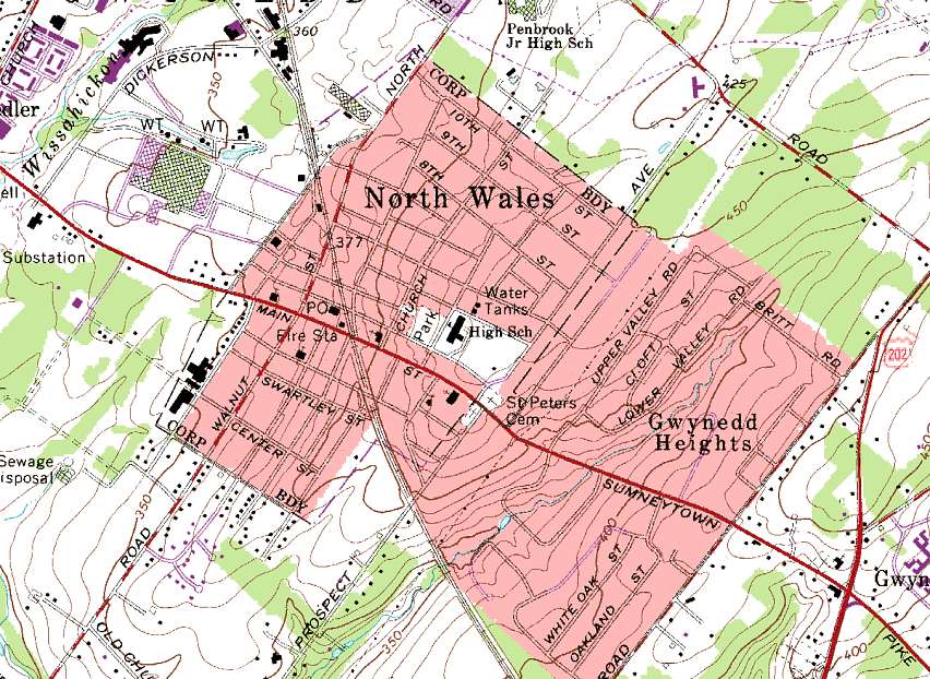
A few miles northwest of the college is North Wales. North Wales has a high concentration of buildings, so rather than trying to draw them all, they are shown on the map as a red area. There are a few landmark buildings marked on the map inside this area – churches (black boxes with with a little cross, the Fire Station, and a square marked PO for post office. All fine and straightforward (except that the North Wales post office has moved). You can see a few developments around North Wales (and additions to the industrial buildings Northwest of it) in purple. These have expanded and changed substantially since this map was made. The SEPTA R5 Commuter rail line runs through North Wales (almost north to south in the center of the image, and you can see a powerline (short black dashes and circles) almost forming an X with it (look right next to Upper Valley Road – the powerline runs behind it).
|
And again, for comparison, here is an aerial photograph from 1993 of North Wales. Note that the area marked sewage disposal West of North Wales on the map above, has, by 1993 turned into a development. The SEPTA rail line runs through a shallow railroad cut south of North Wales, and is thus quite clearly visible on the aerial photograph. Likewise, the powerline that crosses the rail line on the southeast side of North Wales shows up a narrow strip of open space. |
|

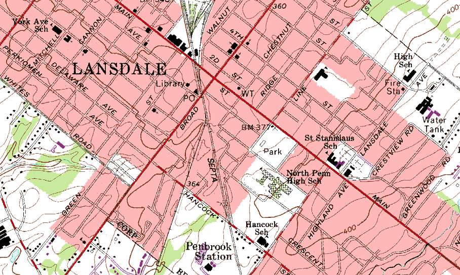
A little bit further away from the college, up in the Northwest corner of the map is Lansdale. Above is an image of part of Lansdale. You can see lots of the same kinds of features that you have seen elsewhere in the quadrangle. I would like to point out a few others in particular.
|
Benchmarks are an important feature you can find on topographic maps. A benchmark is a marker that was placed in the ground when the surveyors were out making the map. If you go looking in this park in Lansdale, you should be able to find a concrete marker in the ground with a circular brass disk about 3 inches across stuck in it right where the map shows the little x. A surveyor could place a surveying instrument on a tripod above that benchmark, hang a plumb bob from the instrument to hang directly over the center of the brass disk, and know that they were in exactly the same place as everyone else who used that benchmark. Benchmarks are typically marked on topographic maps with their elevation, so this benchmark is 377 feet above sea level. |
|
|
Below is the benchmark from the map above. It only took a few minutes of wandering around the park to locate it. |
Here is a closeup of the benchmark. A little hard to read, but it appears to be stamped Lansdale No 2, 1935. It was emplaced by the US Coast and Geodetic Survey, an agency that has been subsumed into the US Geological Survey. |
|
|
|
Many different sorts of geographic features are shown on topographic maps. Each of these has its own symbol. Some of these symbols are obvious, others are not.
|
Schools are shown on USGS topographic maps as buildings with a flag. Here is a highschool in Lansdale. |
|
|
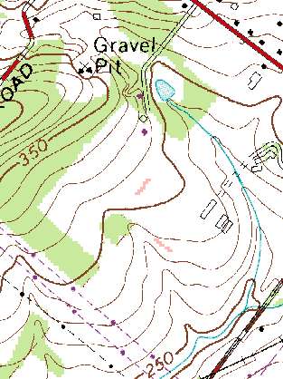
 The blue line in the map above is a stream. This stream is flowing |
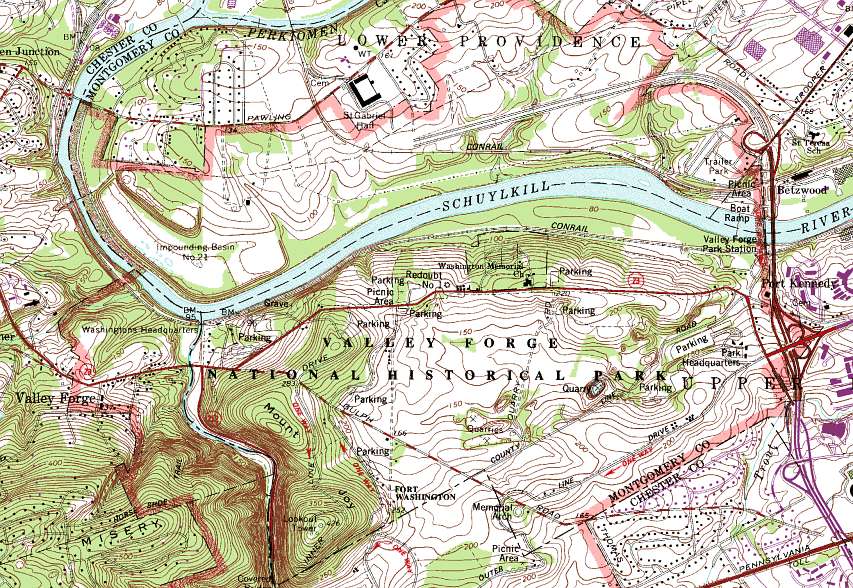
Below is an image from another topo quad from a little bit further south showing the Valley Forge National Historical Park. You can also look at a high resolution image of the Valley Forge Quad.

There are lots of things to be seen on this map, though some have changed, as this map is based on aerial photographs from 1980 and field checking in 1981. You can see the Schuykill river cutting through the park. The Montgomery County-Chester County border runs, as is often the case, down the center of the Schuykill river. The cloverleaf patterns of some multi lane highway exits are visible along the East side of the image, but route 422 was under construction at this time, and is visible as a partly completed stretch of highway across the top of the image. There is more topography in this map than there is around Lansdale, so lets take a closer look at some of it.
Maps and aerial photos courtesy of the USGS. Text, javascript, and other images Copyright 2005 Paul J. Morris.
![]()
Permission is granted to copy, distribute and/or modify this document under the terms of the Creative Commons Attribution-ShareAlike License. To view a copy of this license, visit http://creativecommons.org/licenses/by-sa/2.5/ or send a letter to Creative Commons, 559 Nathan Abbott Way, Stanford, California 94305, USA
Note that the Creative commons licence is applied to just this page, not to the Athro, Limited site as a whole.